
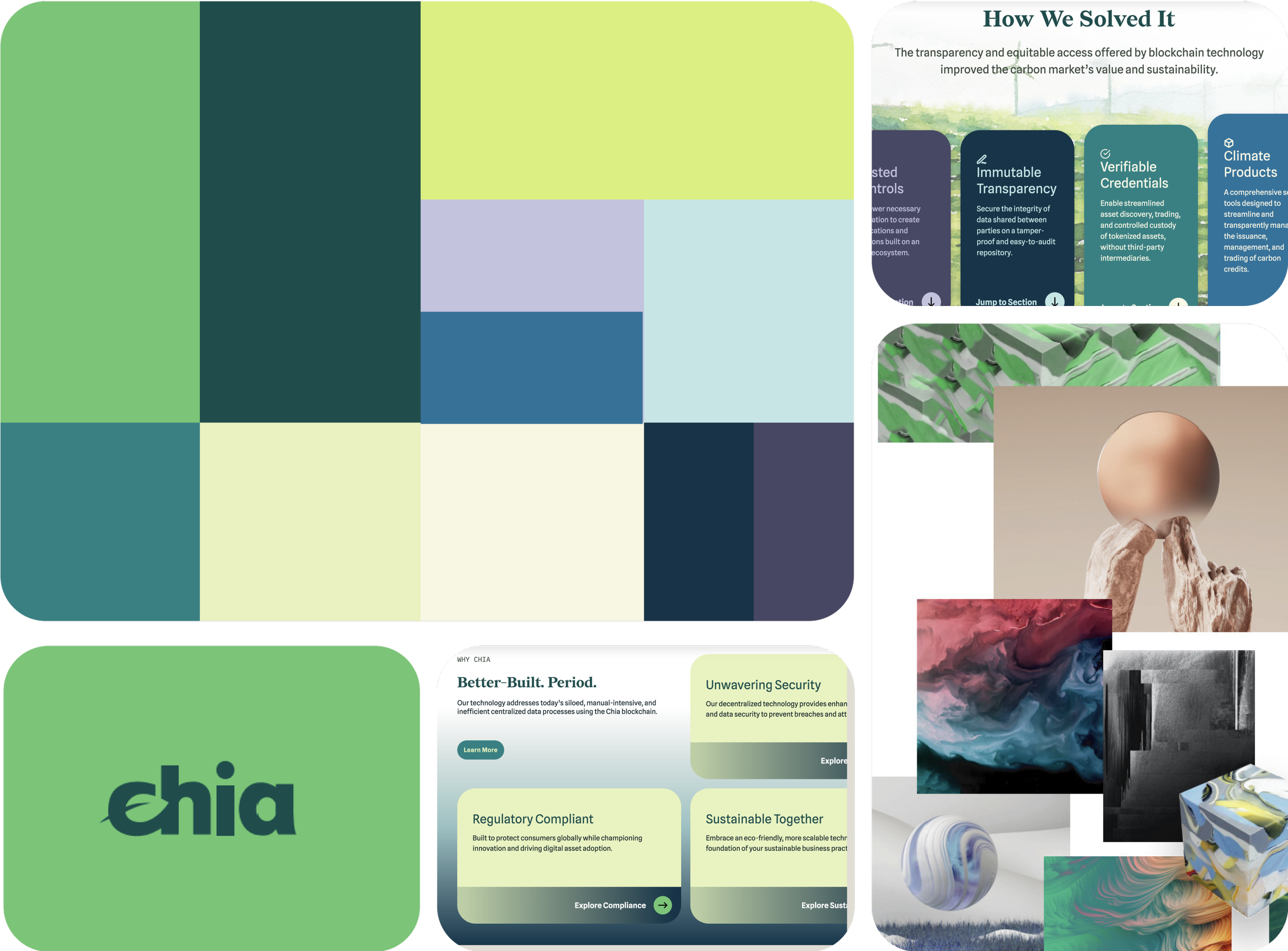
Chia Network
Sano is an innovative wellness facility that is redefining what it means to live well by blending fitness, social connection and lifestyle into a first-of-its-kind wellness social club & wellness loft facilities. It brings together a collective of premium fitness and wellness providers in beautifully designed loft spaces, with a membership-based club featuring saunas, cold plunges, luxury locker rooms and much more. Sano isn’t just a wellness facility—it’s a movement.
Project Scope:
— Brand Strategy
— Brand Identity & Guidelines
— Website Design
— Social Media Content
— Presentation Design
— Apparel Design
— Signage Design
Brand Audit Before Rebrand
The overall color palette looks bold, bright and playful in the brand guidelines, but when it is put to use on the website it feels muted, and gradients become muddy.
Brand Audit Before Rebrand
The overall color palette looks bold, bright and playful in the brand guidelines, but when it is put to use on the website it feels muted, and gradients become muddy.
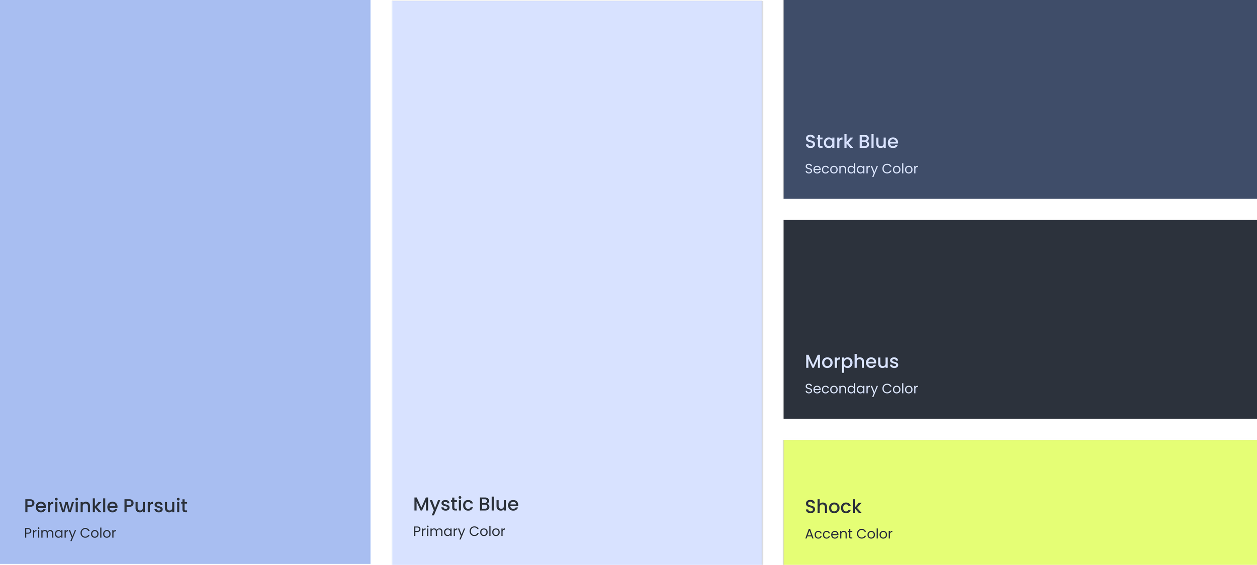
Brand Color Palette
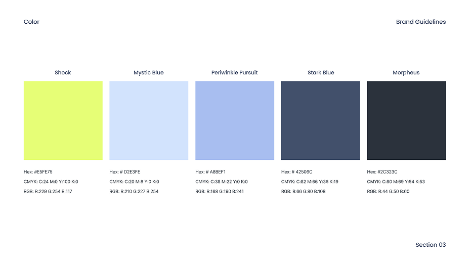
The color palette is inspired by earth tones to embody wellness and recovery, while incorporating a bright pop to represent fitness and energy. Hypnotic Sea and Recovery are the primary colors, with Terracotta and Dogwood Blossom being Secondary. Vibrancy is reserved for accents to add emphasis and interest.
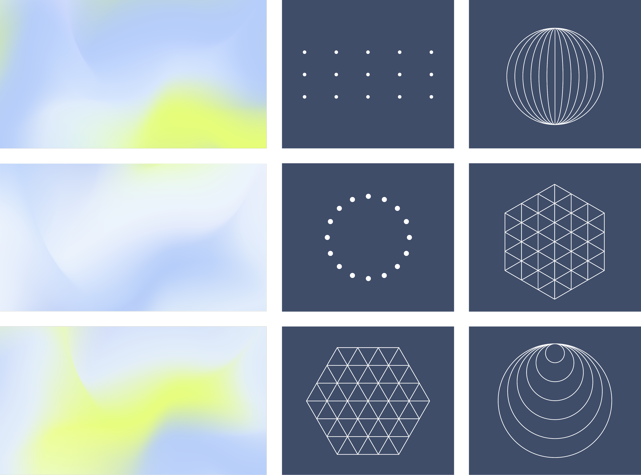
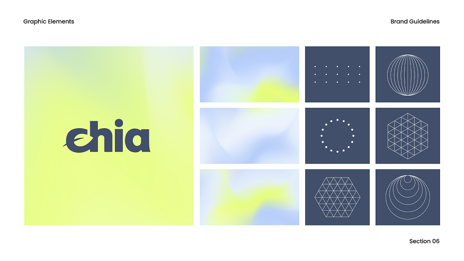
Graphic Elements- Collage Styles & Website
The color palette is inspired by earth tones to embody wellness and recovery, while incorporating a bright pop to represent fitness and energy. Hypnotic Sea and Recovery are the primary colors, with Terracotta and Dogwood Blossom being Secondary. Vibrancy is reserved for accents to add emphasis and interest.

Social Media Templates
The color palette is inspired by earth tones to embody wellness and recovery, while incorporating a bright pop to represent fitness and energy. Hypnotic Sea and Recovery are the primary colors, with Terracotta and Dogwood Blossom being Secondary. Vibrancy is reserved for accents to add emphasis and interest.


Apparel & Signage
The color palette is inspired by earth tones to embody wellness and recovery, while incorporating a bright pop to represent fitness and energy. Hypnotic Sea and Recovery are the primary colors, with Terracotta and Dogwood Blossom being Secondary. Vibrancy is reserved for accents to add emphasis and interest.
Deck Design
The color palette is inspired by earth tones to embody wellness and recovery, while incorporating a bright pop to represent fitness and energy. Hypnotic Sea and Recovery are the primary colors, with Terracotta and Dogwood Blossom being Secondary. Vibrancy is reserved for accents to add emphasis and interest.


Social Media Templates
The color palette is inspired by earth tones to embody wellness and recovery, while incorporating a bright pop to represent fitness and energy. Hypnotic Sea and Recovery are the primary colors, with Terracotta and Dogwood Blossom being Secondary. Vibrancy is reserved for accents to add emphasis and interest.

Ashlee Strathmeyer,
Brand Director, Chia Network
We’ve been incredibly impressed by the work, thoroughness and ease of the project in spite of the quick timeline.
Genuinely, this was a great experience! We've been incredibly impressed by the work, thoroughness, and ease of the project in spite of the arguably insane timeline. We hope to work together again soon.