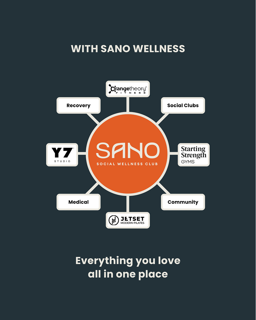
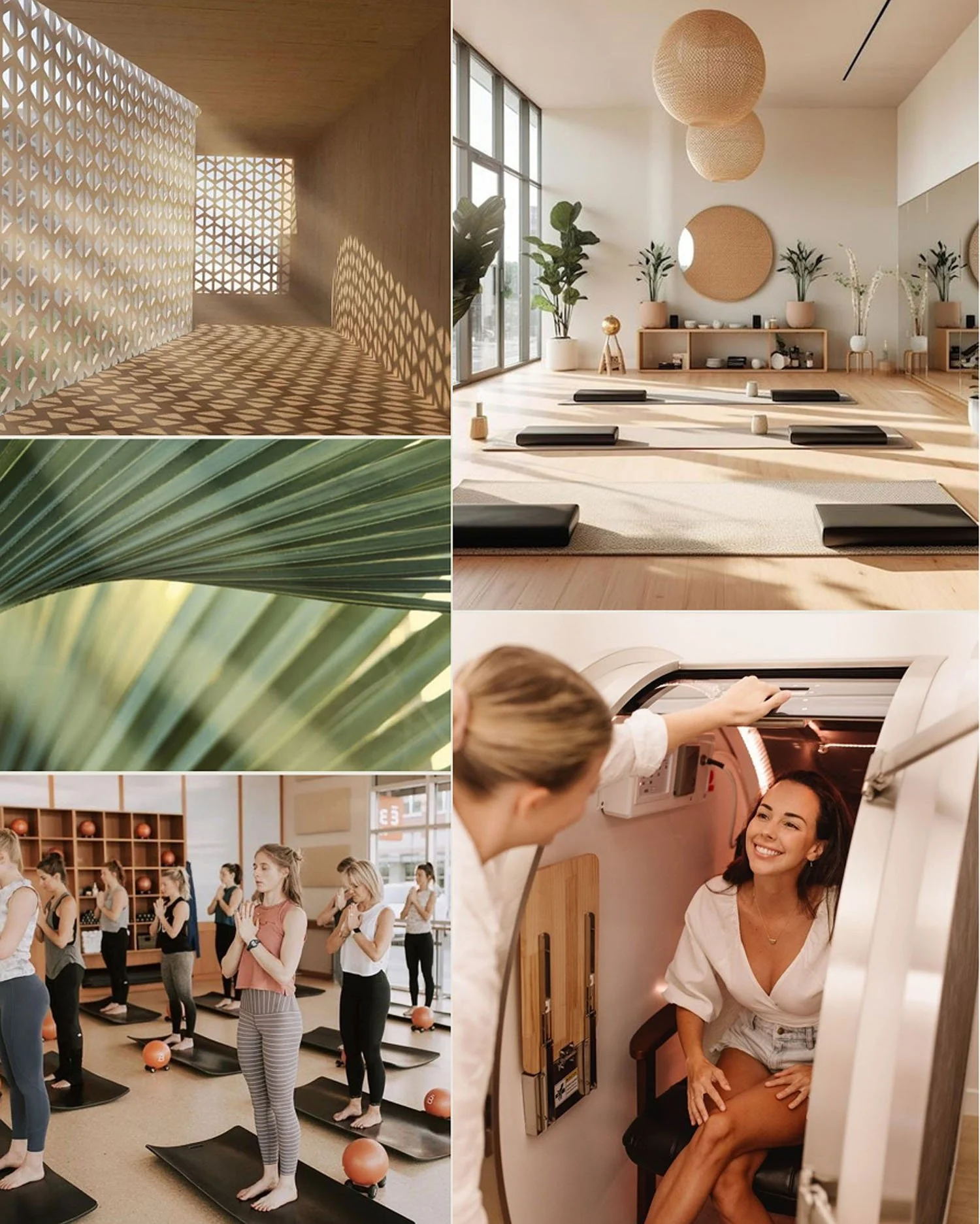
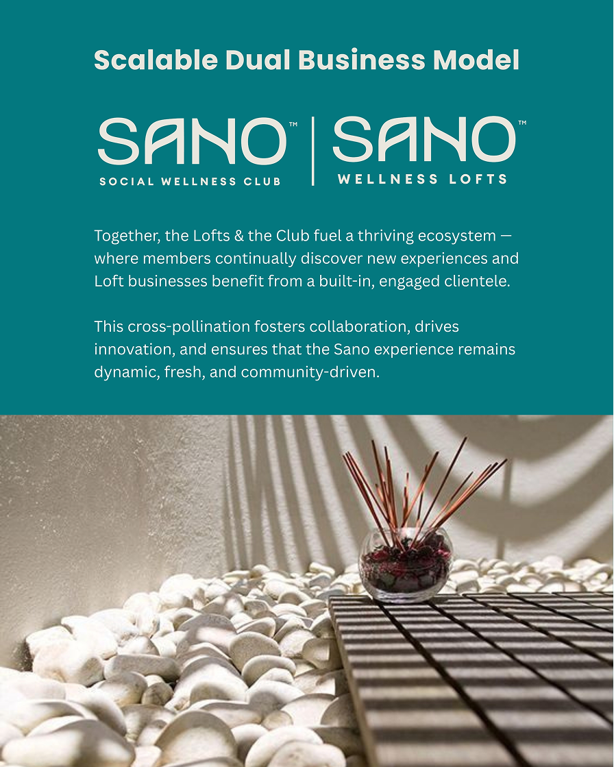
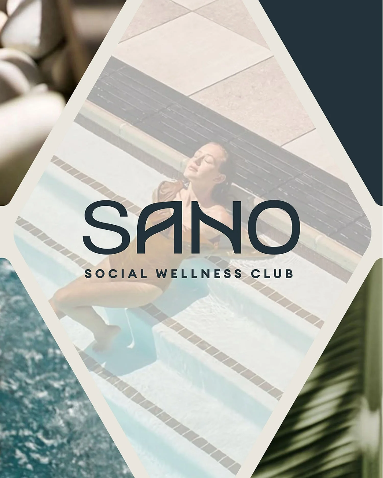
Sano Wellness Club
Sano is an innovative wellness facility that is redefining what it means to live well by blending fitness, social connection and lifestyle into a first-of-its-kind wellness social club & wellness loft facilities. It brings together a collective of premium fitness and wellness providers in beautifully designed loft spaces, with a membership-based club featuring saunas, cold plunges, luxury locker rooms and much more. Sano isn’t just a wellness facility—it’s a movement.
Project Scope:
— Brand Strategy
— Brand Identity & Guidelines
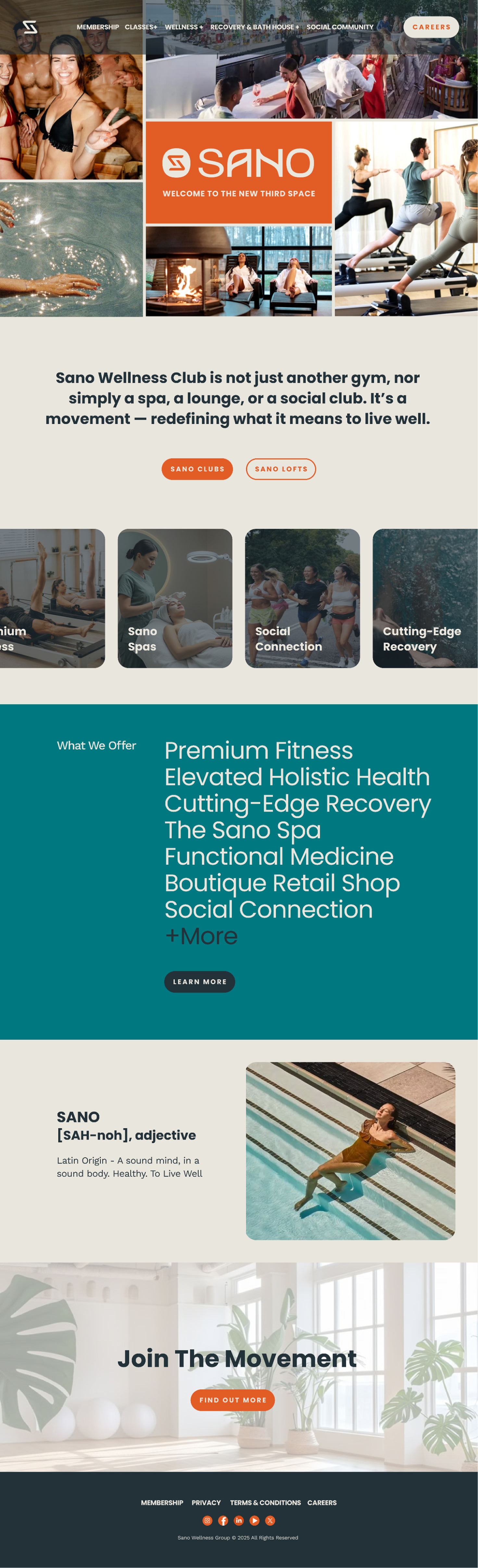
— Website Design
— Social Media Content
— Presentation Design
— Apparel Design
— Signage Design
Logo System
Primary Logo with Full Name
Secondary Logo- Simplified

Logotype

Logomark Variations
Logo Story
The logotype is symbolic of balance and transition. The cross bars in the "A" and the "N" are mirrored, representing transition (sunrise, sunset, passage of time in the week, the highs of a workout and the cool down of the recovery). The negative space in the "A" forms a subtle leaf to symbolize wellness.
The logomark is inspired by the Nordic rune Jera, a symbol of the year’s cycle—representing completion, change, harvest, and the rewards of growth. For Sano, this symbol takes on new meaning: two hands coming together within the circle of our club’s hub, creating connection, fostering community, and celebrating renewal.
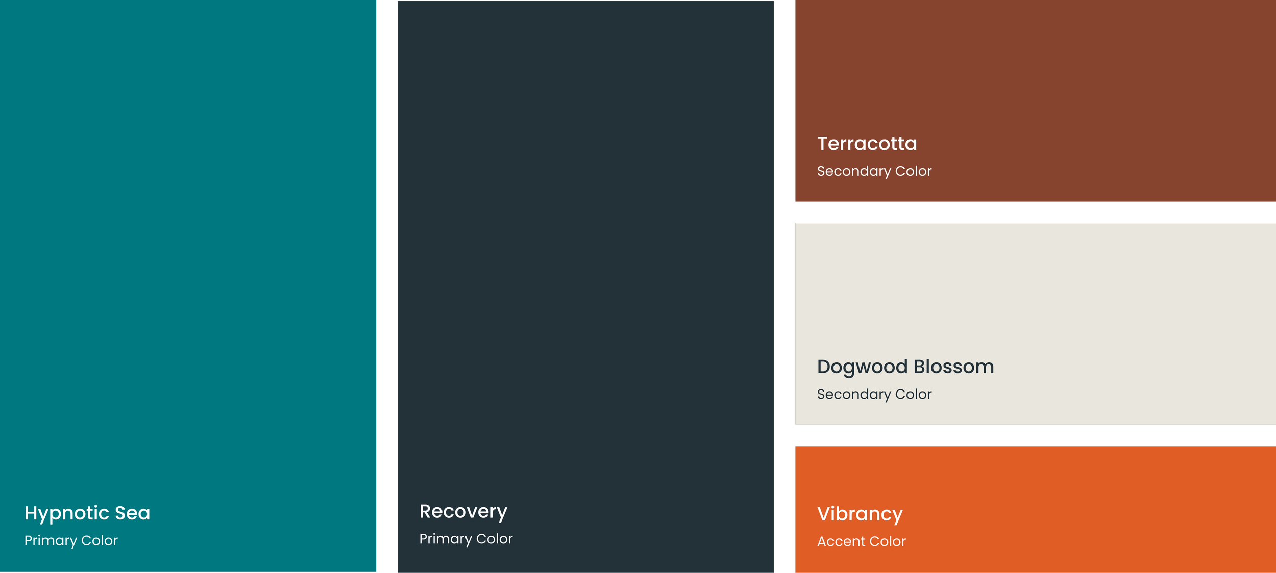
Brand Color Palette
The color palette is inspired by earth tones to embody wellness and recovery, while incorporating a bright pop to represent fitness and energy. Hypnotic Sea and Recovery are the primary colors, with Terracotta and Dogwood Blossom being Secondary. Vibrancy is reserved for accents to add emphasis and interest.
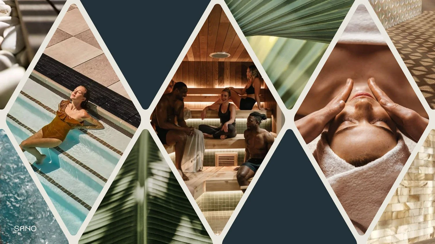
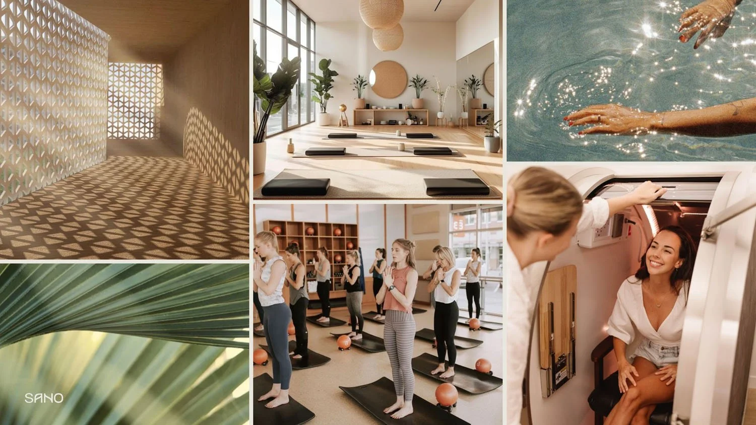
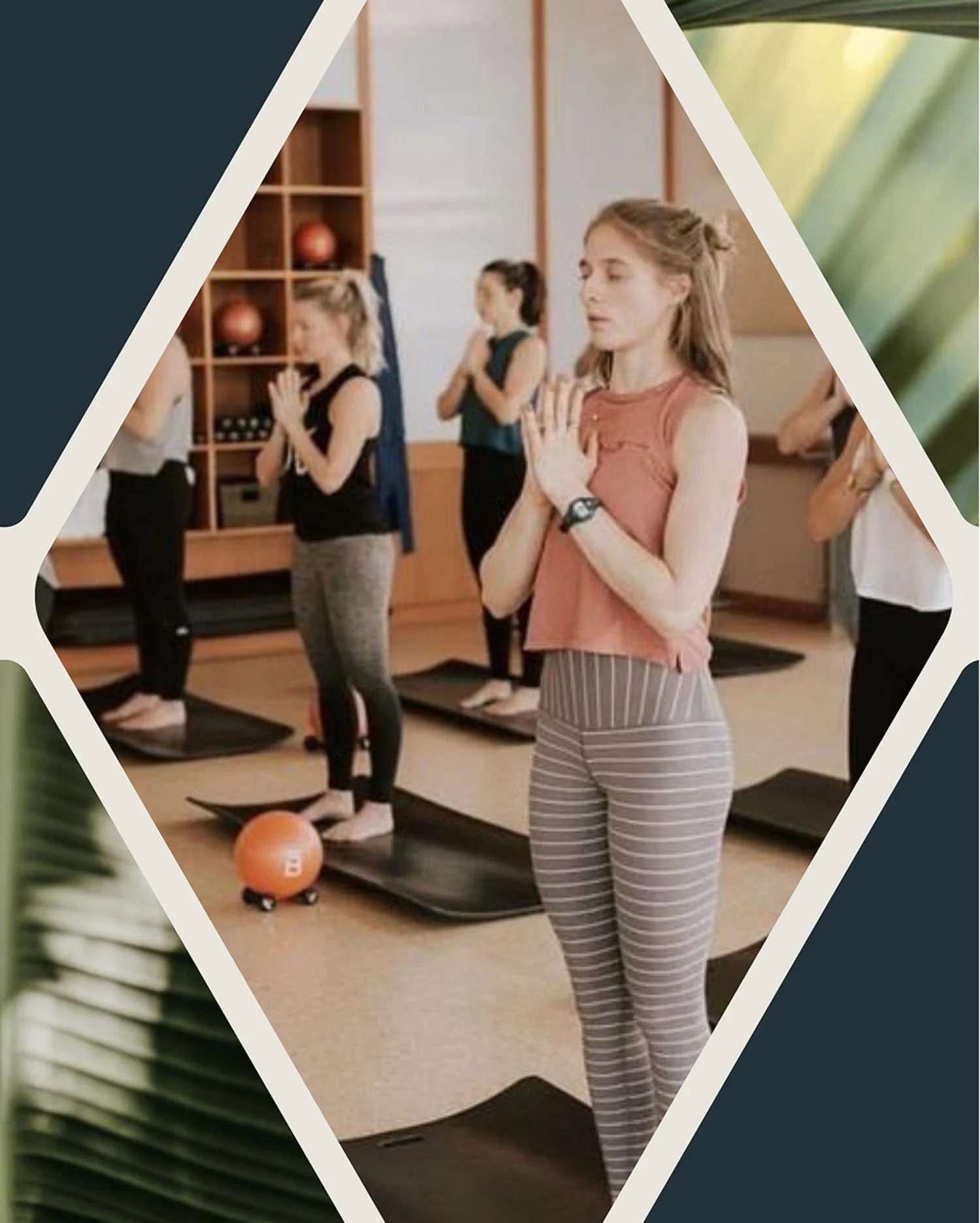
Graphic Elements- Collage Styles & Website
The color palette is inspired by earth tones to embody wellness and recovery, while incorporating a bright pop to represent fitness and energy. Hypnotic Sea and Recovery are the primary colors, with Terracotta and Dogwood Blossom being Secondary. Vibrancy is reserved for accents to add emphasis and interest.
Social Media Templates
The color palette is inspired by earth tones to embody wellness and recovery, while incorporating a bright pop to represent fitness and energy. Hypnotic Sea and Recovery are the primary colors, with Terracotta and Dogwood Blossom being Secondary. Vibrancy is reserved for accents to add emphasis and interest.


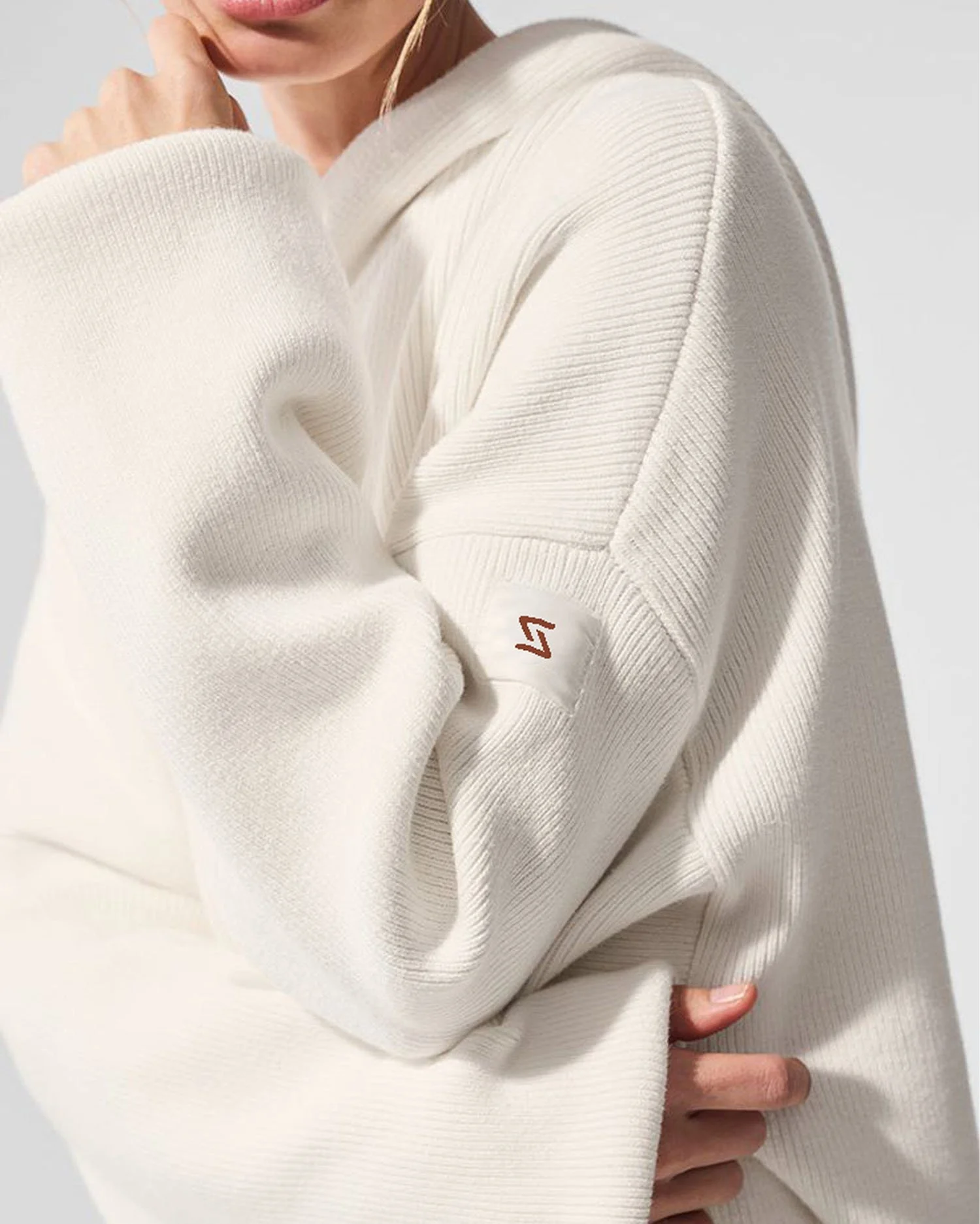
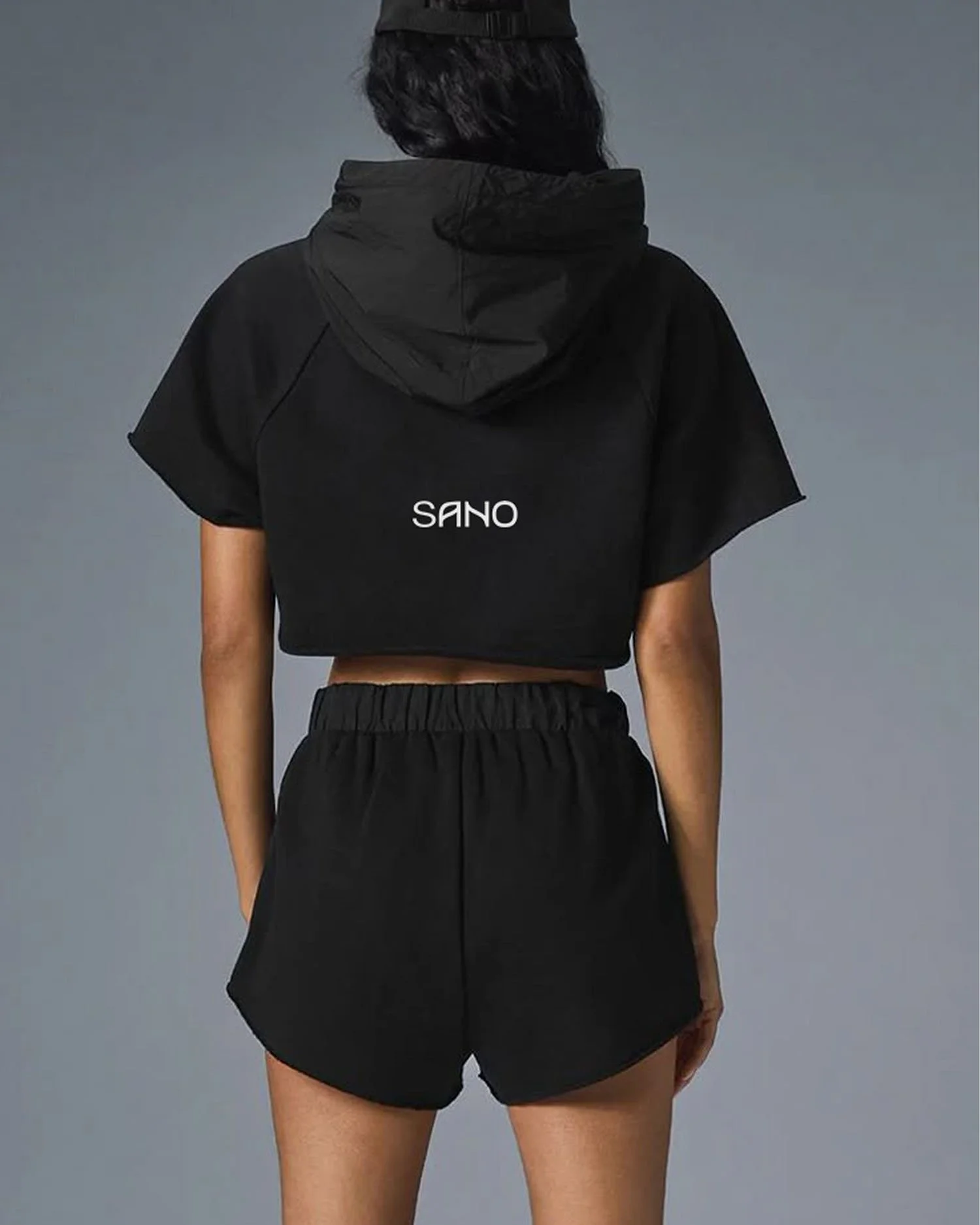
Apparel & Signage
The color palette is inspired by earth tones to embody wellness and recovery, while incorporating a bright pop to represent fitness and energy. Hypnotic Sea and Recovery are the primary colors, with Terracotta and Dogwood Blossom being Secondary. Vibrancy is reserved for accents to add emphasis and interest.
Deck Design
The color palette is inspired by earth tones to embody wellness and recovery, while incorporating a bright pop to represent fitness and energy. Hypnotic Sea and Recovery are the primary colors, with Terracotta and Dogwood Blossom being Secondary. Vibrancy is reserved for accents to add emphasis and interest.


